
How to Organize Your Landing Page
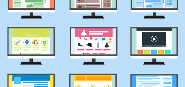

When people visit your landing page, if they can’t find what they are looking for, your landing page doesn’t serve any purpose. The page needs to be easily accessible to your visitors and the information has to be well organized.
There are several essential elements that make up a successful and effective landing page. They are as follows.
Legibility
- Your font should be easy to read and the correct size for your audience
- The background and text colors should complement each other
- You should use a limited number of font sizes and colors throughout your landing page
- Font styles: Arial, Geneva, or Helvetica are the best fonts to use. The reason for this is that they are simple and easy to read.
- Font sizes: 10- to 12-point fonts are the best sizes to use for body text. Other sizes will slow down the pace of the reader. If you have an older audience, you may want to increase your font size by a couple of points. Also, you should allow enough spacing between lines.
- All caps: Don’t use text in all capital letters. It is more difficult to read.
- Line length: Blocks of text over 50 characters wide are more to read. You might want to consider using hard returns in your paragraphs so that your lines don’t become too long when shown on wider computer screens.
- Contrast: It is a good idea to have a high contrast between background and text because it increases legibility. The best combination of colors is black text on white background.
- Text background colors and images: White backgrounds for body text are very effective also. Navigation and header background colors should be relatively light to enhance legibility. High-contrast graphic images are not a good idea as background for text.
Availability: When visitors look at your landing page, they should be able to understand which options you offer. Your navigation needs to stand out and be consistent and in a predictable location.
Organization: Your information architecture needs to be consistent, clear, and it has to address the needs of the customer. It should be separated into a small number of digestible chunks. And, very importantly, it has to be easy to skim and scan.
Fault tolerance: If and when a visitor reaches a road block on your landing page, you need to be ready to suggest helpful and meaningful alternatives. If a visitor makes a mistake on your site (ie, presses the wrong button), your landing page needs to be able to support their reversing their actions easily.
Affinity: Your website needs to be appealing to your visitors. They should feel comfortable while they are visiting. Your landing page should convey credibility and professionalism. Your visual look-and-feel and editorial voice should be totally appropriate for your audience.
These needs are addressed automatically by the visitor’s emotions and can’t be fooled or reasoned with. The visitors’ initial gut reaction of your website will influence their motivation to stay on your website.
Feedback: When users take an action, they deserve to have immediate feedback. Your page should change when the visitor clicks on or mouses over important content so that they are brought to the next step.
We are pleased to provide you with the insightful comments contained herein. For a complimentary assessment of your online presence, let’s have coffee.

|
I'm like to see some examples of what you think are good landing pages.
Some landing pages are one long sales letter i.e. pitch and I have trouble staying focused on the page. . .not sure but maybe Twitter is affecting me where I just want people to get to the point.
The other way to organize a landing page is to use organize your info using the AIDA acroynm: Attention Interest Desire Action, with some video and some audio. What do you think?
Very outstanding website.
The info here is super valuable.
I will refer it to my friends.
Cheers
Very good concept, I like how you convey the message.
Such a great site. I am bookmarking this page.
Such a cool site. I am bookmarking this page.
I somehow dont agree with a few things, but its great anyways.
make sure that your landing page that link from do related and direct show what customer would like to seem from your landing pages such as certain promotion or certain contain and information from you. Make you web design consistant so customer do feel that they in the same website .
If customer do not get what they want in your 1st page they view and the sublink do link to another page, Mostly you get the higher bounce rate which not good for your website.
Make sure that your landing page do have quality content and a proper and constantly web design.