
What to Do to Make Your Website Responsive

If you have a website that is optimized for mobile devices, you may not have any interest in this blog article. However, if you don’t, you may wish to read on because the information that is presented here will probably prove valuable to you.
What to do to engage others
When it comes to marketing your brand and your offerings, you may still be struggling with ways to come up with the most effective marketing strategy to engage your target audience. You are actually right to be concerned. At this point in time, with the numerous advancements that have been made in technology (are other advancements that are still being made), many people are looking to connect with other people online using their mobile devices. Of course, you may view that as somewhat challenging because there are so many different mobile devices that people are using. Each device has a different resolution, screen size, and other capabilities that differ from one device to the next. Of course, there are ways to adapt to the various mobile devices that people are using, which will make the transition smooth and unencumbered. That is a large part of the challenge. The other large part of the challenge is ensuring that your website translates completely across every platform that exists. The most critical question that you need to answer is whether your target audience will be able to find the information on your website that they are seeking. If not, you have an issue and you certainly do not want to mess with the relationship that you share with those people. In fact, you want to go in the opposite direction and strengthen that relationship. If your target audience is not getting what they need from you and your business, they will undoubtedly look for it elsewhere. It is essential that you understand the critical nature of your being able to accommodate your target audience. It is a very sensible idea for your approach to include responsive web design and if you aren’t doing that yet, you should start using that approach as quickly as possible. You will not regret it because it will work for you and for your business.
Put yourself in the shoes of the mobile device user
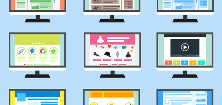
There has been a tremendous increase in the number of people who routinely use mobile devices for business over the last few years. Of course, that doesn’t only refer to mobile phones. It also includes tablets, laptops, etc. Of course, there are still many people who use desktop computers (or a combination of mobile and stationary devices). However, there is tremendous widespread use of mobile devices of all kinds and people rely on them to help them to achieve even greater success in their businesses. It is very important for you to consider the mobile device user carefully, including making sure that the transmission of your content is fast, simple, higher quality, loads more easily, and can be navigated without any issues. There are several things that you can do to successfully optimize your content for mobile devices.
-
Understand your client’s perspective: You can achieve this by paying close attention to the most popular pages on your website. If you are not already using an analytics program (such as Google Analytics, for example), you should start doing so right away. It is critical to your business that you pinpoint what your target audience is looking for and make sure that you take steps to give it to them to the best of your ability.
-
Include all mobile devices: It is very important that you include all mobile devices in your optimization plan; however, it is equally important for you to understand the importance of the smartphone. That will be your cornerstone. As you are thinking about that, make sure that you don’t forget about how long it takes to load your content on a smartphone, the size of your files, etc.
-
Understand the needs of your clients before anything else: If you are able to identify your clients needs and wants, you can satisfy them. You must ensure that your content is relevant to what they are looking for. You must also make sure that the content that you provide them with will be easy to absorb and valuable right off the bat.
Conclusion
Although you are in business to achieve success and to satisfy the needs of your online connections (clients, target audience, etc), you must balance the two and make sure that everyone gets what they need so that progress will be made and you can all get to the next level together. Success is achievable. You just need to reach out and it will be yours. Responsive design (which you will need to make sure you incorporate into your marketing strategy) means that your content will fit any device that anyone is using. That will go a very long way with your online connections. Another big plus is that you will not have to bother making more than one version of your website. One size will really fit all!
We are pleased to provide you with the insightful comments contained herein. For a complimentary assessment of your online presence, let’s have coffee.


Via LinkedIn Groups
Group: ThoseinMedia
Discussion: Is Your Website Responsive?
Thanks for this. It’s important to have a responsive design, but it’s not always so easy. At ConsumerMojo.com, we found that different browsers display our content differently. Our webmaster had to make adjustments.
We also found that our logo looked gigantic on a mobile device and iPad. Again we had to make adjustments. This is a good discussion. But it’s tough unless you a vigilant tech team or people who say, “Hey, this doesn’t look right.”
By Barbara Nevins Taylor
Via LinkedIn Groups
Group: Dr Brian’s Marketing Network – Magical Marketing Ideas for Top Marketers
Discussion: Is Your Website Responsive?
Thanks for posting this article. I’m interested in the differences between responsive design and adaptive delivery when it comes to mobile websites, so I found this article quite helpful!
By Susan Hoffman
Via LinkedIn Groups
Group: WritersWorld
Discussion: Is Your Website Responsive?
Hi, Carolyn: Another great article choice from you. In real estate it is location, location, location. In Web (a website or blog), it is responsive, responsive, responsive–i.e. the template you choose MUST be responsive so that it “responds” to the device it is being viewed on–in this day and age, that will first usually be a mobile device. A website or blog may look awesome on a desktop or laptop, but if those were not designed with a Responsive Layout/Responsive Web Design template they will look awful on a mobile device (what would that say about you and your business–and writing?). WordPress.org has tons of responsive templates. Also, make sure that whatever you choose that videos will play. I know someone who had his website designed in iWeb–an Apple product. So, the videos on the website (even though they were embedded from YouTube) always defaulted to QuickTime–another Apple product, so the videos were only visible on desktops, laptops, and iPhones. Imagine that you pour yourself into your website and/or blog only to find out that it does not respond to mobile devices and/or videos will not play across all devices. The moral of the story: Choose responsive and choose a platform that will play videos–i.e. choose wisely.
By Scott McBean
Via LinkedIn Groups
Group: Online Marketing, Web Analytics, and E-commerce Group — WebAnalysts.Info
Discussion: Is Your Website Responsive?
Now with WordPress this is really easy. A lot of templates or themes, come with this feature. You just have to do minor changes when it’s done and the benefits are huge! As a user I feel frustrated when I find sites that are not mobile responsive and just leave them.
By Xaviera Aguilar
Via LinkedIn Groups
Group: Online Marketing, Web Analytics, and E-commerce Group — WebAnalysts.Info
Discussion: Is Your Website Responsive?
WordPress is very good for making your website responsive. The old way was to see what device was looking at your site and then you could serve up different code to work with that specific device. The newer Media Calls are much better as they can serve up different content for different screen sizes.
In WordPress when you do this, this means that you can Hide / Show parts of your site if you want to for a different screen size. A good example of this would be a form that asks for phone number so we can send text messages to people that visit your website via a smart phone.
Most of the sites we are building today are based on the Genesis Framework. We layer that with some other tools to build rich, responsive designs that once finished, are easy to maintain by the owners.
With so many people moving to Mobile access via tablets and smart phones, I believe responsive design is critical moving forward for any online business.
By Richard Whyte
Via LinkedIn Groups
Group: Online Marketing, Web Analytics, and E-commerce Group — WebAnalysts.Info
Discussion: Is Your Website Responsive?
Your website is where you get to showcase what your business has to offer. You obviously have a lot of freedom over what goes into your website, but to attract clients, endlessly posting can be boring. Always encourage engagement.
By Pat Neuman